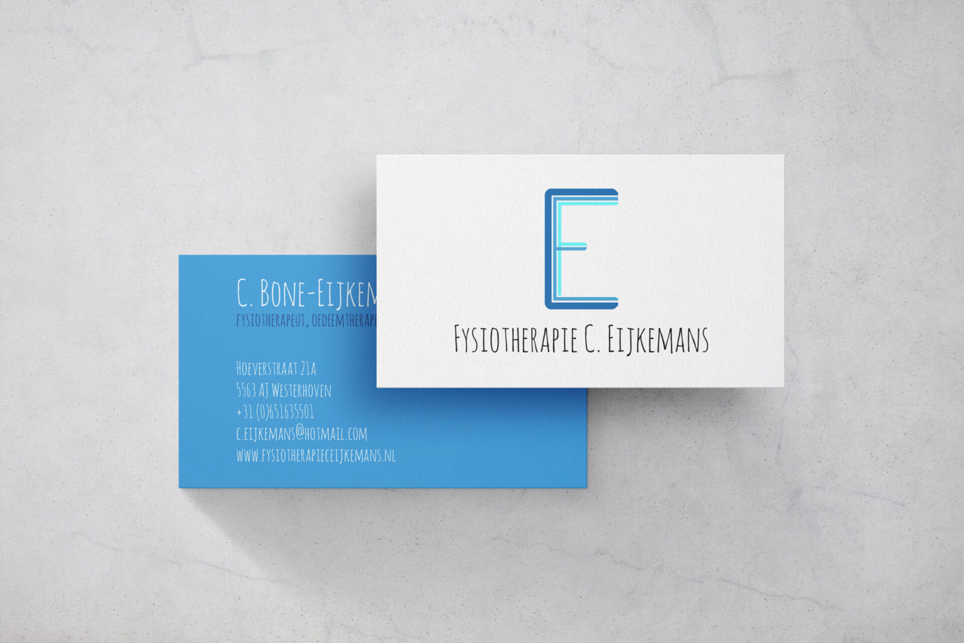
PHYSIOTHERAPY C. EIJKEMANS LOGO & BUSINESS CARDS.
Business Cards | Logo
As my sister’s little brother, I was thrilled to be asked to help her create a logo and business cards for her new physiotherapy business. Starting a new business can be a daunting task, especially in a field as competitive as healthcare. My sister is a dedicated professional with a passion for helping others, and I knew that with a little bit of creative input, I could help her make a great first impression with her clients.
For the logo, I brainstormed several ideas, but ultimately settled on a design that combined the letters C, E, and F. By merging these letters together, I was able to create a unique and memorable logo that would be easily recognizable by her clients. I carefully selected the colors of white and blue to convey a sense of professionalism and trust, which is especially important in the healthcare industry. The use of a playful font added a touch of friendliness to the logo, which was perfect for my sister’s specialization in physiotherapy for children.
Thanks to my sister’s dedication and the design of her business cards, her business has been flourishing.


